Goooooal! How data stewards score with data visualization
Data stewards and soccer referees have more in common than you'd think
By Analise Polsky, Best Practices, SAS
Every time I watch a soccer game, especially the international games, I always look forward to the celebratory yell of the announcer, “goooooal!”
One night after watching a rather intense match, I sat down to peruse a few data publications. I found myself shouting “daaaaataaaaa!” (to no one in particular) with the same tenacity and energy of the “futbol” announcers. I needed a little injection of humor after reading a few too many data management articles. It started as my own private joke, but then it hit me. How enterprises govern and manage their data is not so different from some aspects of soccer.
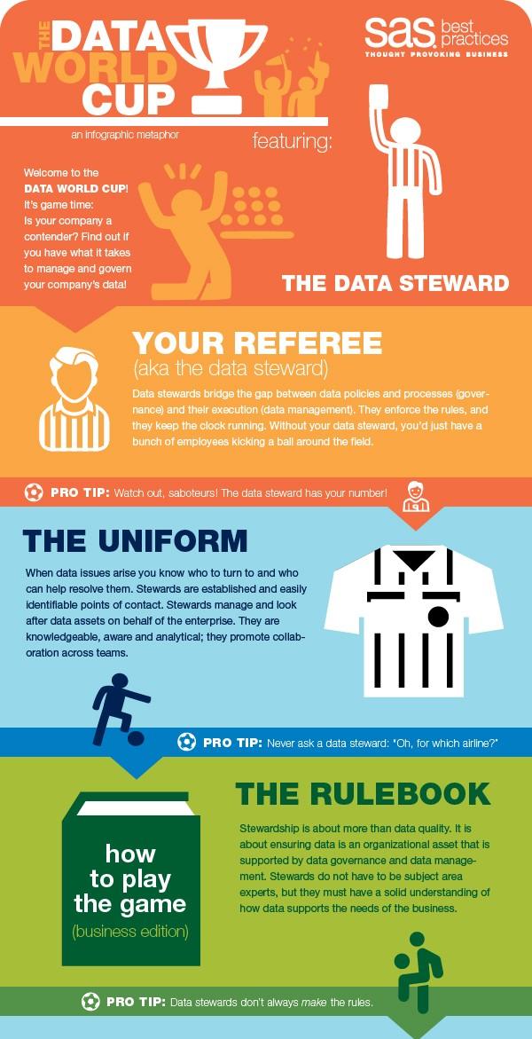
Take data stewardship. Stewards are much like referees, ensuring that players adhere to the rules. While keeping the integrity of the data a priority, stewards negotiate territorial and procedural struggles between teams, like sales and marketing or business and IT. Governance councils and leadership task stewards with the responsibility of identifying data-related problems, and give them the authority to fix these problems. Stewards rely on technology to help track and monitor the data. This is when the flags and red/yellow cards come flying onto the field.
For instance, data rules help stewards maintain the data within specific parameters. For example, in retail all SKU codes are alphanumeric and less than 10 characters — yellow card! Dashboards and alerts tell stewards the type of rule violated, the frequency of the violation and when it occurred — flag! They can see a history of any triggered alerts and rule violations to pinpoint potential triggers, presented in the form of a data visualization (graphs, charts, gauges, etc.).
Data visualizations help stewards process and understand what is happening in the data. They represent a mental snapshot of what violation occurred that resulted in the referee (steward) making the call. The power of data visualization in the hands of a steward isn’t limited to dashboards. Much of data analysis relies on visualization, including data profiling, searching for anomalies in new data sources, or seeing if there are missing values in an important field, like “SSN.” Data visualization works because the brain can only process so much data in a tabular format. Technology enables stewardship, therefore intuitive tools will be needed to get the job done – preferably those that support how the human brain processes data.
Thinking of stewards as akin to referees gives me a new appreciation for the work they do. Both can be tough and often thankless jobs, but they are critical components of business and futbol. Who will your data referee be for your next match?
Check out our infographic to learn more about how stewards fair in the “Data World Cup.” Or make sure you train the best referees possible by participating in our interactive workshop, Data Stewardship Planning.
Analise Polsky is a thought leader on the SAS Best Practices team. The focus of her work is developing and delivering data quality, data stewardship, culture and change management, and data visualization best practices. She has also created training materials for database and application products, which she has presented to a wide variety of clients in multiple languages.

Read More
- Learn how stewardship teams are organized by downloading the white paper 5 Models for Data Stewardship.
- More data management insights.

