Why your brain needs data visualization
The benefits of processing information through pictures
By Analise Polsky, thought leader, SAS Best Practices
According to Research Scientist Andrew McAfee and Professor Erik Brynjolfsson of MIT, the amount of data that crosses the Internet every second is greater than all the data stored in the Internet just 20 years ago. This amounts to exabytes of data being created on a daily basis.
If you tried to picture each individual data value that is being generated just in your company, your head would spin. The human brain is incapable of processing more than one value at a time let alone hundreds, thousands, millions or billions. Yet, information can inform and enlighten your business practices, direction and vision. Fortunately, there is something to help your brain not only imagine your corporate information, but consume it. Enter data visualization.
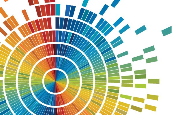
Data visualization is the representation of data in a pictorial or graphical format. The purpose of data visualization is to simplify data values, promote the understanding of them, and communicate important concepts and ideas. Visualizations are the single easiest way for our brains to receive and interpret large amounts of information. Data visualization gives business users the ability to use information intuitively, without deep technical expertise. Even novice users can create data visualizations that are meaningful, such as pie charts, line graphs, bubble charts and heat maps.
Advanced data visualizations support more in-depth and complex analytics. A visual tier that sits on top of the analytics program lets users view the results of complex algorithmic processing. Not only can they get insight into what’s happened, they can forecast what might happen, using rich graphics to quickly derive business actions. The fact is, when people transition from spreadsheets to data visuals, they are able to register the values they are seeing as a whole.

Consider the manufacturing director of product reliability for an international company that produces small motors, like the ones you find in toothbrushes, toys or cell phones. Each year the company makes millions of vibrating cell phone motors. One of the director’s principal responsibilities is to determine how reliable the cell phone motors will be with each year of age. If the product’s reliability falls short of the standards set forth by the cell phone manufacturers who use the motors, his company could lose major contracts.
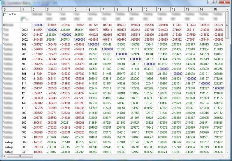
A traditional electronic spreadsheet cannot visually represent the amount of data that is collected on the age and reliability of the cell phone motors. In print, the spreadsheets would look like small mountains on the director’s desk. In both cases, the director would lose countless hours poring over millions of rows of data, and he would still be none the wiser about his original question of the age of the motor and its reliability.
Data visualization represents the data in a way that the director can easily interpret, saving him time and energy. For example, Figure 2 shows the number of units that correspond to each age (represented by the color gradient) as well as the reliability as the age of a unit increases. In a matter of seconds, he can see that units approaching 10 years of age are approximately 40 percent reliable. This visual simplifies the totality of the data, instantly clarifying what is happening with the reliability of the cell phone motors.
Regardless of his computer expertise, the director can quickly derive meaning from the data that supports his job function. When the visuals are generated only by a technical user, on the other hand, it can leave a lot open for interpretation.
Whether they work at the corporate headquarter or in the field, employees can use data visualization tools to unite around common visuals, inviting new conversations around data usage and decisions. In the long run, this collaboration can save time and help bridge some of the decision gaps between business areas.
Mobile applications for tablets increase the sharing and dissemination of data visuals among business users. Web-based applications unchain us from traditional desktop applications and encourage mobility. Managers, account representatives and executives can all access visual reports and see key performance indicators from anywhere. Having a centralized access point for important reports and indicators minimizes the endless paper and email trails that often result in miscommunication and misinformation.
There is no going back. The flow of data will not shrink in the near future; in fact, it will continue to grow exponentially. Time is doing us no favors, and we may not always have access to or the resources for all the technical experts that we think we need. Today we can use data visualizations and the advanced analytics that supports them to meet these challenges head on.
Analise Polsky is a thought leader on the SAS Best Practices team. The focus of her work is developing and delivering data quality, data stewardship, culture and change management, and data visualization best practices. She has also created training materials for database and application products, which she has presented to a wide variety of clients in multiple languages.

Read More
- See for yourself what data visualization can do for you.
- Return to Analytics Insights.
