A Tale of Two Universities
By Ciarán Nevin, SAS Ireland
“In 2012, UCD climbed three places in the QS world university rankings, fell 28 places in the THE rankings, while not moving at all in the ARWU rankings. You probably would avoid a restaurant with such confused reviews, so how could you be expected to make one of your biggest life decisions with such poor information?”
It was the best of times, it was the worst of times, it was the age of wisdom, it was the age of foolishness, it was the epoch of belief, and it was the epoch of university rankings. Not a direct quotation from one of Dickens’ best works, this is A Tale of Two Universities – a tale of the real university and of the measurable university, and of the gaps in between.
University rankings spark plenty of public interest, and why shouldn’t they? Education is something dear to our hearts and dear to our pockets. You might wonder how your university has fared. The answer is probably both “quite well” and probably also “quite poorly”. Perhaps, all in the same year.
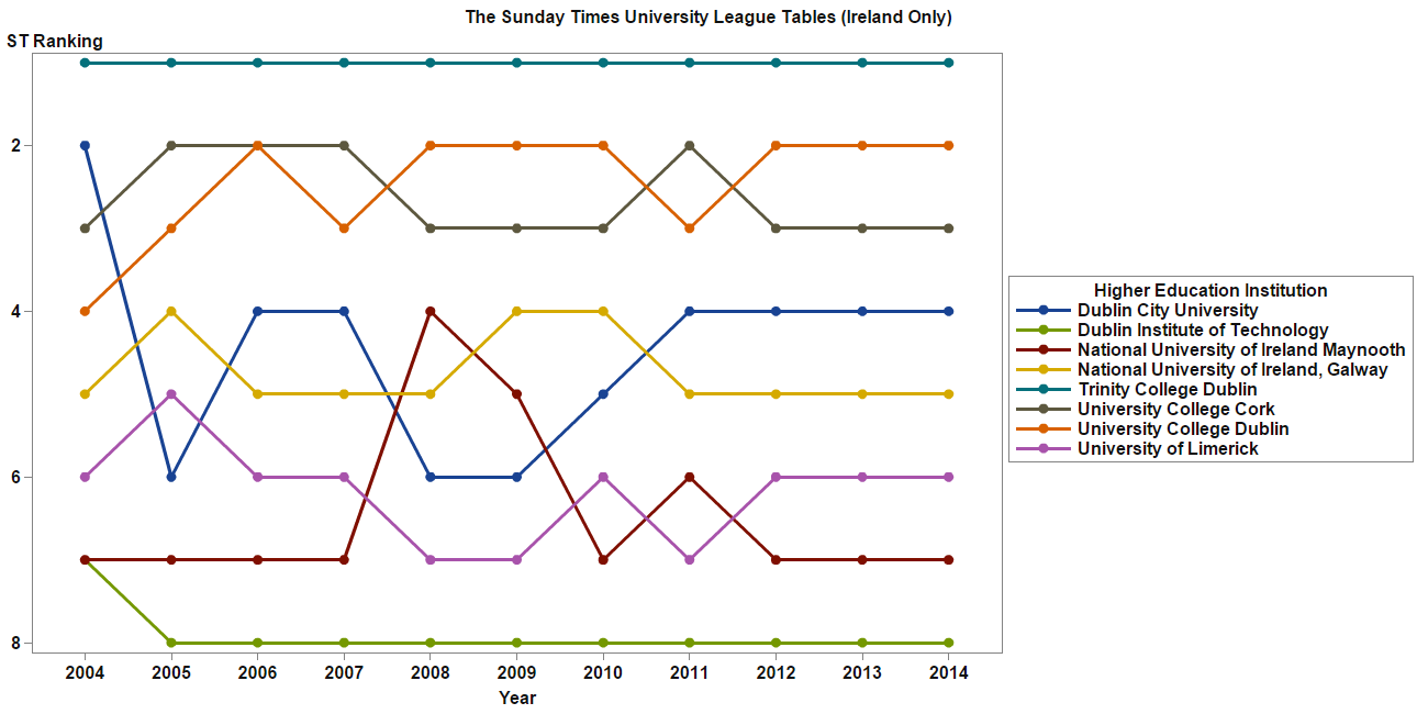
Figure 1 below might look like a transport map for a major European city. In fact, it shows the Sunday Times University League Tables results over the past 11 years. When I brought this data together and created the line-chart that you see below, I was struck by something: NUI Maynooth climbed three places in just one year and then fell back three places just two years later. Anyone who has ever experienced higher education knows that these large institutions are incredibly slow to change, for better or for worse. NUI Maynooth has approximately 8,000 students and can trace its roots back to 1795. How can such a large organisation, with such strong traditions change so quickly? What could explain such dramatic results? It was time to examine the methodology.

Figure 1 – The Sunday Times University League Tables (Ireland Only)
The Sunday Times scores universities in six areas, as follows (percentages indicate weightings) [1]:
- Leaving Certificate points for entry (33%)
- Research funding won in previous year, per full time staff member (13%)
- Percentage of graduates known to be seeking employment nine months after leaving (13%)
- First and Second Class Honours as a percentage of total awards (13%)
- Staff-student ratio (13%)
- Completion rate, as a percentage of those who started six years ago that had completed their studies a year ago (13%)
The use of these metrics as indicators of a university’s standing and quality has its limitations, however. Leaving Certificate points for entry, for example, are a function of the demand for college places relative to the number of places available. The collapse of the construction industry in Ireland between 2007 and 2013, led to a decline in the points required to study architecture. First preference choices for architecture dropped from 2,383 in 2007 to just 621 in 2013 [2]. Institutions with large schools of architecture will have suffered disproportionately, though this does not mean that the quality of the university has deteriorated. These institutions are also likely to suffer under the graduate employment area, owing to the high levels of unemployment for graduates in the construction sector.
Equally, the research funding metric is biased towards universities with schools of medicine or health sciences as the research funding awarded in these areas far outstrips that of the social sciences, for example.
Where in the world?
How do Ireland’s Universities fare on the international stage? Three rankings systems, with three distinct methodologies dominate this area: Times Higher Education (THE), Quacquarelli Symonds (QS), and Academic Ranking of World Universities (ARWU). The ARWU only ranks three Irish universities and does not typically give a precise position but instead states a band within which a university falls.
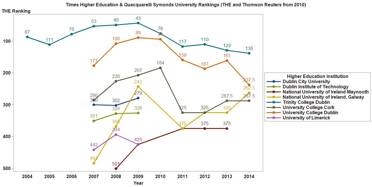
Again, I observed that one year can bring huge changes in position for each of the universities – University College Dublin (UCD) can be seen to climb 69 places in 2008 in Figure 2. This leads to very enticing headlines but is this real life or is this just fantasy?

Figure 2 – Times Higher Education & Quacquarelli Symonds University Rankings (THE and Thomson Reuters from 2010)*
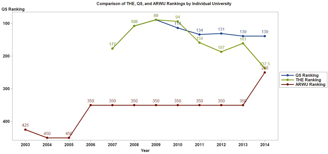
Let’s look a little closer at UCD using the three world ranking systems in Figure 3. You’ll note that THE and QS went their separate ways in 2009/10, each adopting distinct methodologies. This leads to the interesting scenario where, In 2012, UCD climbed three places in the QS world university rankings, fell 28 places in the THE rankings, while not moving at all in the ARWU rankings. You probably would avoid a restaurant with such confused reviews, so how could you be expected to make one of your biggest life decisions with such poor information? It’s time to return to the methodologies.

Figure 3 – Comparison of THE, QS, and ARWU Rankings of UCD*
The QS rankings are based on four areas of analysis: research, employability, teaching, and internationalisation. [3]
Times Higher Education bases its analysis on five areas: teaching, research, citations, industry income, and international outlook. [4]
The ARWU uses the following four indicators: quality of education, quality of faculty, research output, and per capita performance. [5]
Each of these methodologies has similar weaknesses to those identified with the Sunday Times League Tables earlier. As an example, the ARWU measures quality of education by the number of alumni winning Nobel Prizes and Fields Medals. It may surprise you that Sweden has won more Nobel Prizes for Literature than all of Asia combined.
Naturally this all leads to attention grabbing articles, often without rigorous analysis. You might think that rankings keep universities on their toes but the results are often confusing and contradictory and provide little real information for policy makers and academics. It could be argued that they are in fact a distraction from the real business of academic quality assurance. The snapshot below (Figure 4) shows how the University Observer published two stories within a month of one another - one showing a positive result, the other showing a negative one.

Figure 4 – An example of headlines resulting from university rankings
The job of reporting on all this is not made easy for journalists. The ranking agencies typically show their results compared against those of the previous year only (historical results are contained in other locations). Without being easily able to view results over many years, sweeping changes can be perceived - leading to sensational headlines and poor analysis.
The end result is a tale of two universities – the real university and the university portrayed by commentary on the latest rankings. The university that is big and old and slowly evolving, and the over-simplified representation of a university derived from a handful of indicators.
___
* In some cases, the exact positions are not cited by the ranking agencies and instead the positions are banded. Where this is the case, the midpoint of the band is used to create the chart. For example, the University of Limerick was placed in the 501-550 range by the QS rankings in 2014 and I have used the figure of 525 to chart this.
[1] http://9thlevel.ie/university-rankings/sunday-times-league-table/
[2] http://www.cao.ie/index.php?page=app_stats&bb=mediastats
[4] http://www.timeshighereducation.co.uk/world-university-rankings/2012-13/world-ranking/methodology
[5] http://www.shanghairanking.com/ARWU-Methodology-2014.html
About SAS
SAS is a global leader in data and AI. With SAS software and industry-specific solutions, organizations transform data into trusted decisions. SAS gives you THE POWER TO KNOW®.