Is your data too big to visualize?
Six techniques to simplify your big data visualizations
Big data volumes are so large that it can be hard to imagine what your data actually looks like. The size and complexity of so much data can be difficult to illustrate, let alone explore.
Lucky for you, it doesn’t take an IMAX Theater or a virtual world to view big data. With a few data visualization techniques, you can explore and interact with even the largest big data volumes using a standard visual interface. Start with these concepts, which range from basic to more advanced.
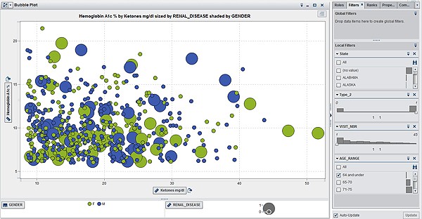
Filtering. When working with large amounts of data, being able to quickly and easily filter your data is important. What if you only want to view data for a certain region, product line or some other variable? You can use filtering capabilities to refine the information you see. Another way to better understand the composition of your data is through the use of histograms. Histograms provide a visual distribution of the data along with cues for how the data will change if you filter on a particular measure. Histograms save time by giving you an idea of the effect the filter will have on the data before you apply it.

Figure 1: This visualization shows data filtered into two categories: male and female.
Binning. To display results of data exploration and analysis in a way that is meaningful and not overwhelming, you may need a new way to look at the data that collapses and condenses the results in an intuitive fashion but still displays graphs and charts that decision makers are accustomed to seeing. One potential solution is to use binning, or the grouping together of data. For example, you could show billions of data points by year instead of month. When you bin data on both axes of a graph, you make it easier to visualize the big data. Binning an also be used with box plots, which can be especially useful with data so large that even your outliers include millions of data points. (Figure 2: This box plot compares the distribution of data points within a category.)
Figure 2: This box plot compares the distribution of data points within a category.
Autocharting. When working with massive amounts of data, it can be difficult to immediately grasp what visual might be the best to use. Autocharting takes a look at the data you wish to examine and then, based on the amount of data and the type of data, it presents the most appropriate visualization. Intelligent autocharting can help nontechnical users easily visualize their data – no matter how large it is.
Figure 3: The heat map above was created using an the autocharting feature in SAS Visual Analytics.
Overview bars for high cardinality. Cardinality becomes a concern with big data because the data can have many unique values per column, and displaying that many values in a chart or graph is difficult to understand. One method for dealing with high cardinality is to use bar charts that condense the data but also provide an overview bar that zooms into the bar chart and enables information consumers to scroll through the entire chart.
Figure 4: High cardinality in a bar chart with big data may be difficult to understand.
Figure 5: The overview axis bar below the bar chart shows the high cardinality in this big data more clearly. You can easily scroll through the entire chart.
Network diagrams. Data variety brings challenges because semistructured and unstructured data require new visualization techniques. Network diagrams view relationships in terms of nodes and ties. Nodes represent the individual actors in the network and ties represent the relationships between the individuals, such as friendship, kinship or business relationships. Network diagrams generally show nodes as points and ties as lines. Businesses are using network diagrams to understand relationships and influence between customers or groups of customers. Law enforcement agencies often use network diagrams to map relationships between clandestine or covert organizations. You can also superimpose the network diagram on top of a map, to show relationships across geographic regions, as seen in Figure 6.
Figure 6: Network diagrams explore relationships within a data set, including connections across geographic areas.
Correlation Matrices. Since many big data sources are coming into the organization in a constant stream of data, data velocity can present challenges. A correlation matrix combines big data and fast response times to quickly identify which variables are related. It also shows how strong the relationships are between variables. Identifying these relationships can help speed up your analytics life cycle because analytical modelers can perform variable reductions more quickly and efficiently.
Figure 7: In this correlation matrix, darker boxes indicate a stronger correlation; lighter boxes indicate a weaker correlation.
If you are working with massive amounts of data, displaying results of data exploration and analysis in a way that is not overwhelming can be a challenge. Using the tips above can help you find new ways to look at big data, so you can quickly collapse and condense the results in an intuitive fashion.
Remember that the best visual to convey your information is usually the simplest. Getting to know your audience and how they like to consume information will also help you find the best visualization techniques for your data – big or small.

Read More
- Looking for more data visualization techniques, from basics to big data? Read this visual analytics white paper and learn more about generating the best visualizations for your data.
- Implement these techniques with SAS® Visual Analytics.
- Get more insights on analytics, big data, data management, marketing, and risk & fraud.
